Email Studio
Reimagining how small businesses create and send email. From blank canvas to confident send.
Role
Design Leadership
Team
Product · Design · Research · Engineering
Platform
Desktop / responsive web
Outcome
A simpler composition model, guided creation, and a connected path from writing to send
Responsibilities
The editor had become powerful, and complicated.
Years of functionality had made the email editor capable, but that capability came with a cost. Customers were being asked to understand the structure of the editor before they could simply create.
Research surfaced friction across fundamental tasks: editing text, resizing images, changing backgrounds, moving content, navigating the workflow, and understanding the difference between sections and blocks.
80–776 sec
Range in editor task completion time
Across participants in usability testing
3 of 5
Desktop participants asked for in-editor guidance
Raised independently, unprompted
36 clicks
Worst-case count to find basic controls
In the pre-send experience
Figures are findings from moderated usability studies, not production-wide metrics.
“I couldn’t figure out how to make this one smaller.”
“Maybe a brief guided tour.”
“An AI little bot to help.”
“Initial enthusiasm dropped significantly once users entered the editor.”
We were not trying to make the old editor prettier. We were trying to make creating an email feel obvious.
The team reframed the work around reducing cognitive load and helping customers keep momentum, rather than around modernizing the interface.
Start with the customer’s intent
Let people begin creating instead of configuring the tool.
Reveal complexity when it is needed
Use progressive disclosure rather than presenting every capability at once.
One clear mental model
Reduce overlapping concepts such as sections, blocks, and layouts.
Keep the path to send visible
Creation, validation, testing, and sending should feel like one continuous workflow.
Turning friction into design principles.
Each structural decision traced back to something we watched customers struggle with.
Users struggled to understand sections versus blocks.
Move toward a blocks-first composition model.
15 block types competed for attention even though a small number represented the overwhelming majority of usage.
Progressively disclose creation tools instead of showing everything at once.
Users could not find subject, preview, and send controls.
Treat sending as part of the editor workflow instead of a disconnected destination.
Users expected AI assistance but struggled to discover it.
Make the assistant persistent and contextual to the work being created.
Users needed confidence before sending.
Surface test sends, email health, mobile preview, and send planning directly in the workflow.
One canvas. One composition model.
Instead of asking customers to hold several structural concepts in mind, the new editor opens on a canvas and invites writing. Formatting appears when content is selected rather than occupying permanent interface space, and richer compositions are built from a small set of primitives: text, heading, image, button, social, divider, spacer, and columns.
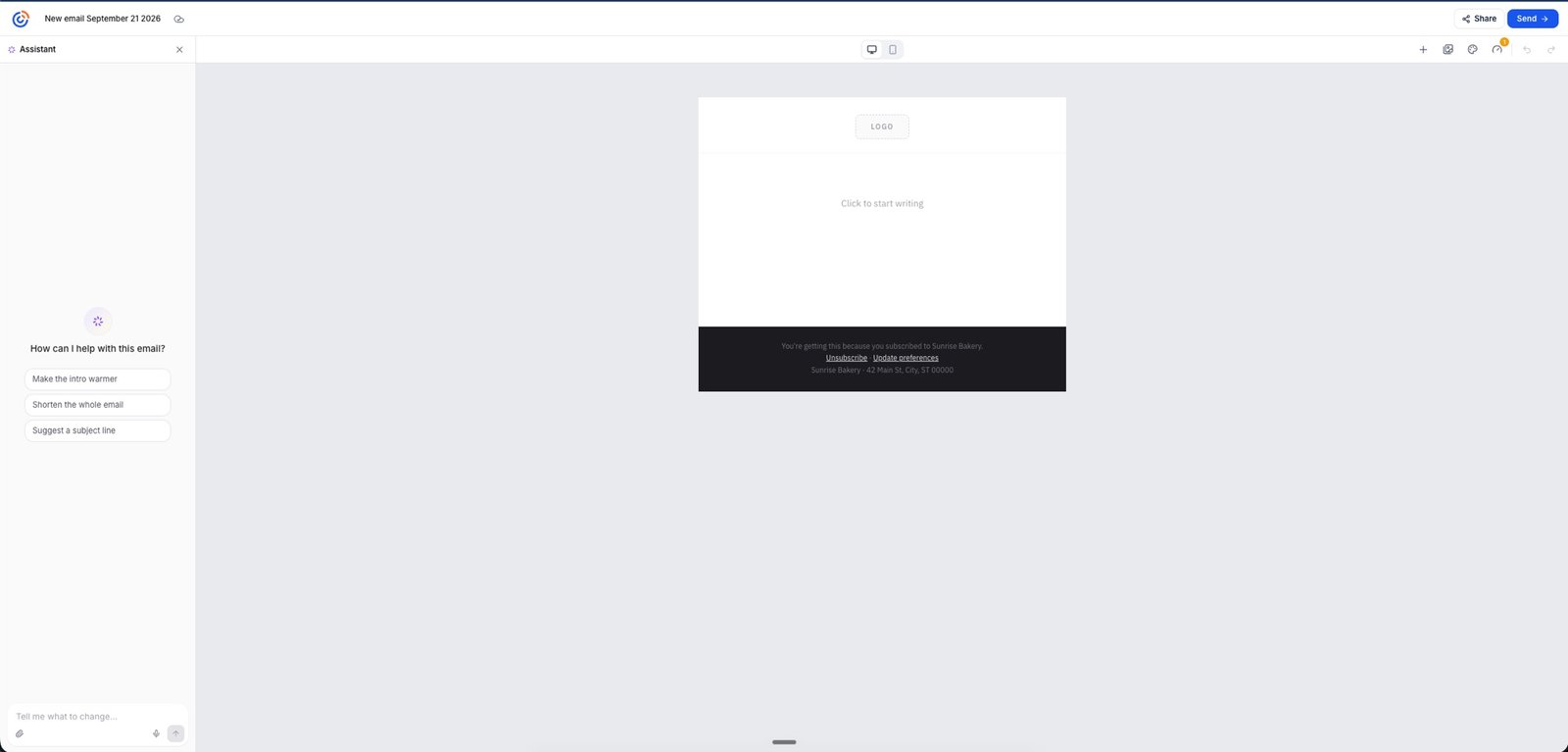
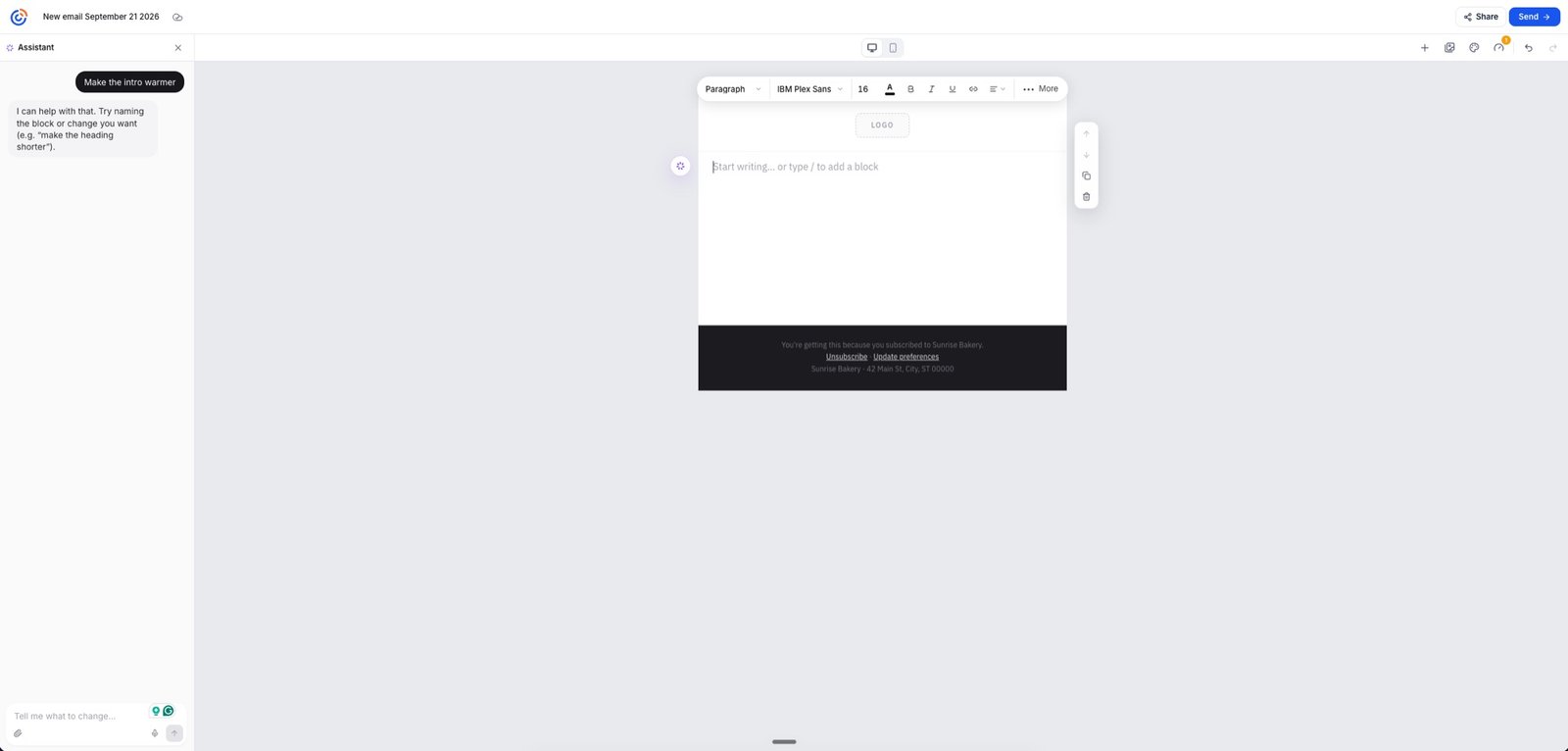
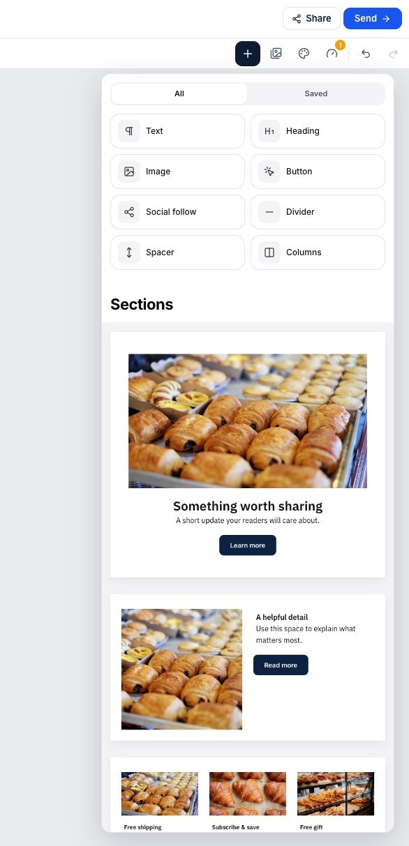
“Complexity still exists. It just does not need to be visible all the time.”
AI that works alongside the creator.
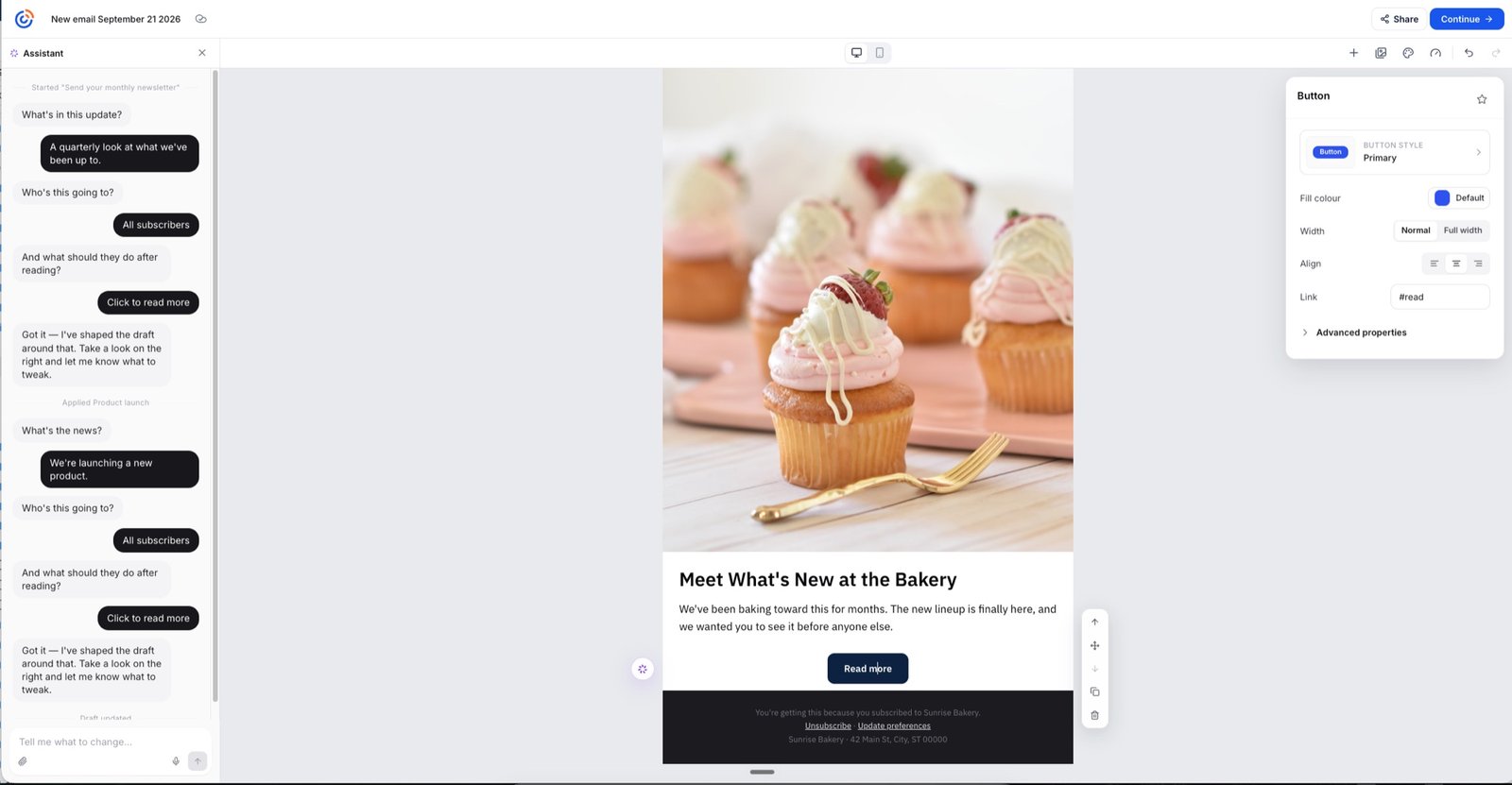
The assistant is not a separate destination. It sits beside the canvas, gathers the minimum context it needs, and shapes a draft while the actual email stays visible and editable.
In this exchange the assistant asks what the update covers, who it is going to, and what readers should do next, then reports back: got it, the draft is shaped around that. The customer edits directly on the canvas from there.
“The assistant accelerates the work without taking the creator out of the editor.”
Guided creation, not AI magic.
- 01
Describe
The customer says what they are sending.
- 02
Gather
The assistant asks only for the context it needs.
- 03
Draft
A first version appears on the canvas.
- 04
Edit
The customer changes it directly, in place.
- 05
Iterate
The assistant stays available for the next pass.
A quieter interface with more capability underneath.
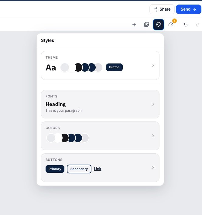
Style system
Theme, fonts, colors, and button styles consolidated into one focused panel, so global changes do not require hunting through individual elements.
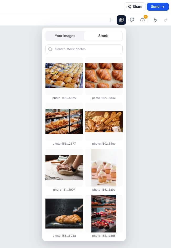
Image library
Customer images and stock photography are available without leaving the creation workflow.
Content blocks
Common blocks are surfaced first, with richer prebuilt sections available for customers who want a starting structure.
- Text
- Heading
- Image
- Button
- Social
- Divider
- Spacer
- Columns
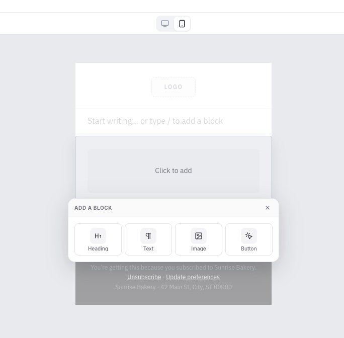
Mobile preview
Desktop and mobile views switch from the same toolbar, without leaving the canvas.
Designing the last mile.
Research showed the transition between editing and sending was a critical friction point. Rather than treating send as a separate administrative screen, the final decisions moved into a focused panel inside the workflow.
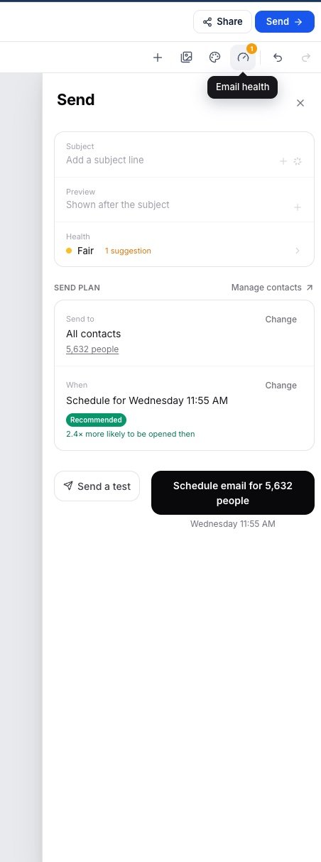
One send panel
Subject, preview text, email health, audience, and recommended send time sit together, with a test send and the final schedule action at the bottom.
- Subject
- Preview text
- Email health
- Audience
- Recommended send time
- Test send
- Schedule or send
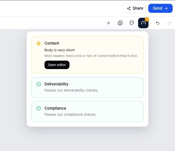
Email health
Email health turns invisible requirements into actionable guidance across content, deliverability, and compliance, telling customers what needs attention without blocking progress unnecessarily.
- Content
- Deliverability
- Compliance
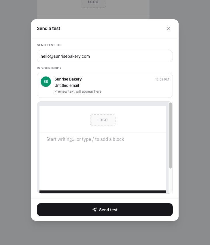
Make confidence part of the workflow.
Sending a campaign is high stakes, particularly for newer customers. The test send shows a realistic inbox preview, with sender identity, subject, and preview text, before anything reaches the full audience.
We tested simplification instead of assuming it would work.
An earlier simplified-editor experiment preserved first-send performance but hurt repeat-send behavior. Follow-up changes to navigation, subject-line visibility, and CTA hierarchy were tested, but the experiment ultimately did not outperform the control.
That result was more useful than a win would have been. It ruled out the cheaper explanation and pointed at the structure of the experience itself.
- 01
Simplify UI
Remove interface chrome from the existing editor.
- 02
Test
Run it against the control with real customers.
- 03
Measure
First send held. Repeat send did not.
- 04
Learn
Chrome was not the binding constraint.
- 05
Rethink flow
Redesign the create-to-send journey instead.
“The signal was clear: the problem was not just chrome. It was the structure of the experience.”
Simplify what people see, not what they can do.
Usage data showed that a small number of blocks carried almost all of the work. That made progressive disclosure a data-backed decision rather than a stylistic one.
~95%
of non-layout palette inserts
Came from text, image, button, divider, and spacer
98%
of block usage
Represented by the top six blocks
15
block types competing for attention
In the experience being replaced
Product usage data from the existing editor.
Composition without another taxonomy.
Legacy layout behavior showed strong demand for composition, but that did not mean customers needed a second structural vocabulary to learn. The strategy separated composition by scope instead.
Templates
Reusable full-email composition, for customers who want to start from a structure.
Blocks
Individual building pieces, kept few enough to learn quickly.
Saved blocks
Future reusable mid-email composition, without inventing a new layout system.
From idea to send.
Start with a blank canvas
The editor opens ready to write rather than ready to be configured.
Write directly or work with AI
Type into the canvas, or describe the email and let the assistant shape a first draft.
Add content as needed
Blocks are introduced when they are wanted, not presented all at once.
Style globally or locally
Set theme, fonts, colors, and buttons once, or adjust a single element in place.
Add imagery without leaving the editor
Customer images and stock photography are one panel away.
Preview across devices
Switch between desktop and mobile from the same toolbar.
Check email health
Content, deliverability, and compliance checks surface what needs attention.
Send yourself a test
A realistic inbox preview before anything reaches the audience.
Choose audience and timing
Audience and recommended send time sit beside the final action.
Send with confidence
Creation and sending read as one continuous workflow.
Leading the direction, not just the screens.
I helped lead the product and experience direction for the new editor, working across design, product, research, and engineering to turn usability findings and behavioral data into a simpler creation model.
My role went beyond designing screens. I helped frame the problems we needed to solve, establish the experience principles, guide designers through exploration and iteration, evaluate experiments, and connect individual interaction decisions back to the larger create-to-send journey.
A foundation for a simpler creation experience.
The work moved the team from incremental simplification toward a more cohesive vision for email creation, one that treats writing, designing, assistance, validation, and sending as parts of the same workflow.
Just as importantly, experimentation helped us identify what was not enough. Simplifying individual controls could reduce friction, but the larger opportunity was simplifying the entire journey.
Less to learn
A smaller, more consistent composition model.
More guidance
AI, contextual tools, and health checks help customers keep moving.
Clearer path to send
Creation and sending feel like one connected workflow.
Power does not have to feel complicated.
The goal was not to remove capability. It was to make sophisticated email creation feel approachable enough that customers could focus on their message instead of the tool.
04 · TripAdvisor