My Library
Customers already understood the Library. The opportunity was to make it faster, not to make it different.
Role
Director of Product Design & Lead Designer
Team
Product · Design · Research · Engineering
Timeline
3 months
Outcome
7% increase in trial to paid customers · Modernized without losing familiarity
Responsibilities
Making content easier to find, manage, and reuse.
My Library is the asset hub behind Constant Contact’s campaign creation experience. Customers rely on it to upload, find, and reuse the images and files that power their marketing.
We redesigned the experience around the tasks customers actually perform, making asset management faster and more intuitive without introducing unnecessary complexity.
Almost every customer touches it. Few of them linger.
Product analytics and research pointed at the same behavior pattern, and it set the constraint for everything that followed.
%
of users upload images
M
images uploaded
Over six months
“The Library is not a destination customers browse. It is a utility they enter to accomplish a task and get back to creating.”
Do not redesign for the sake of redesigning.
Discovery research revealed something important: customers were not asking for a dramatically different Library. They described the existing experience as simple, straightforward, and functional.
The biggest opportunities were not aesthetic. They were functional: finding assets, managing larger libraries, and reducing repetitive work.
Find faster
Customers struggled to locate assets when filenames were inconsistent or libraries became large.
Work at scale
Power users needed easier selection, batch actions, and asset management.
Keep it familiar
Customers had established workflows. The redesign needed to improve them without forcing people to relearn the product.
A simpler, more visual Library.
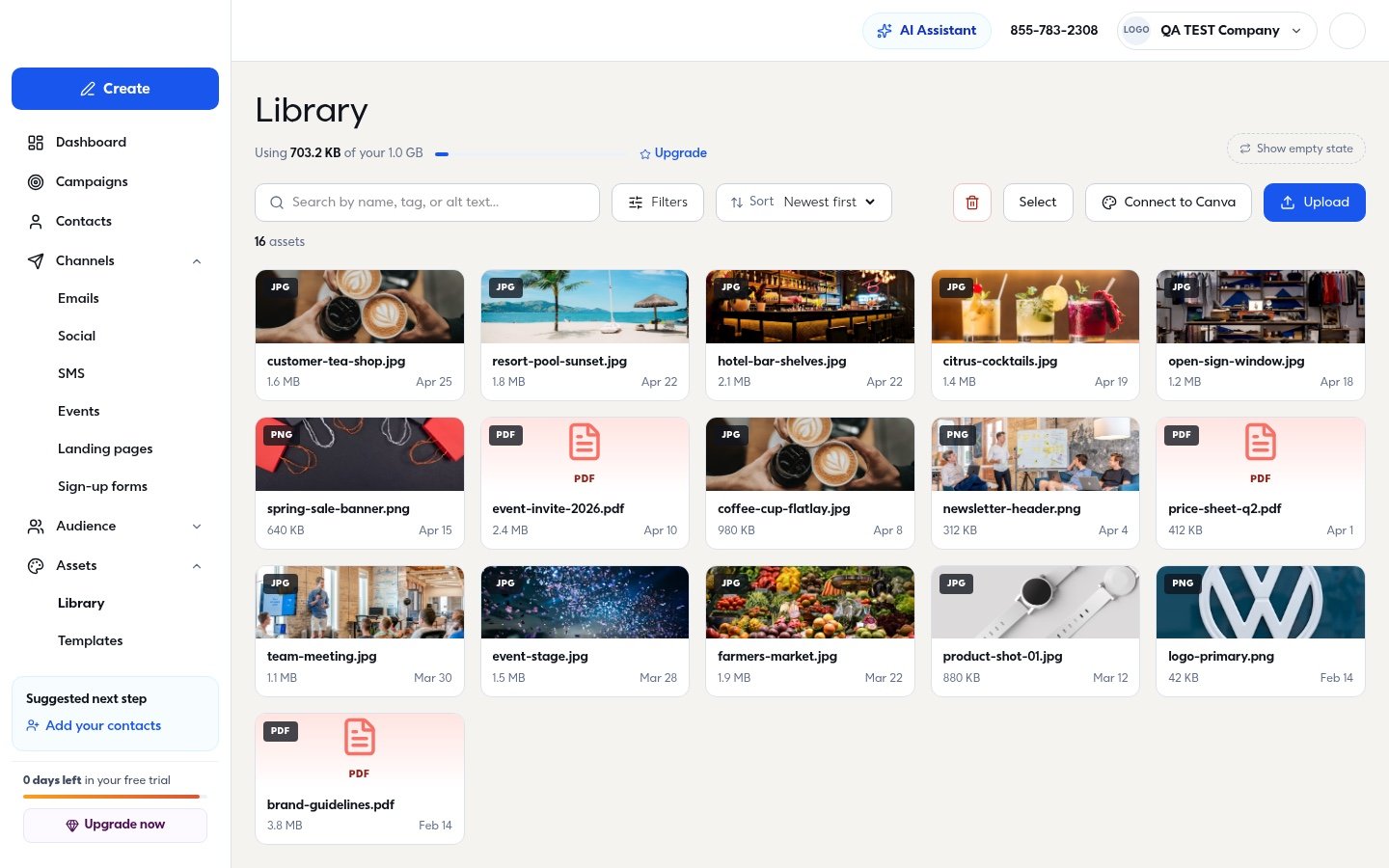
Every control a customer needs to narrow a large library sits in a single row above the assets, and the assets themselves lead with the image rather than the filename.
Search & discovery
Search by name, tag, or alt text, with filtering and sorting that helps customers narrow large libraries.
Visual asset management
Image-first cards make assets easier to recognize and scan.
Integrated creation
Upload and Canva are surfaced directly within the core Library workflow.
Simplified management
Selection, deletion, sorting, storage information, and asset actions are available without overwhelming the default experience.
Simple when browsing. Powerful when needed.
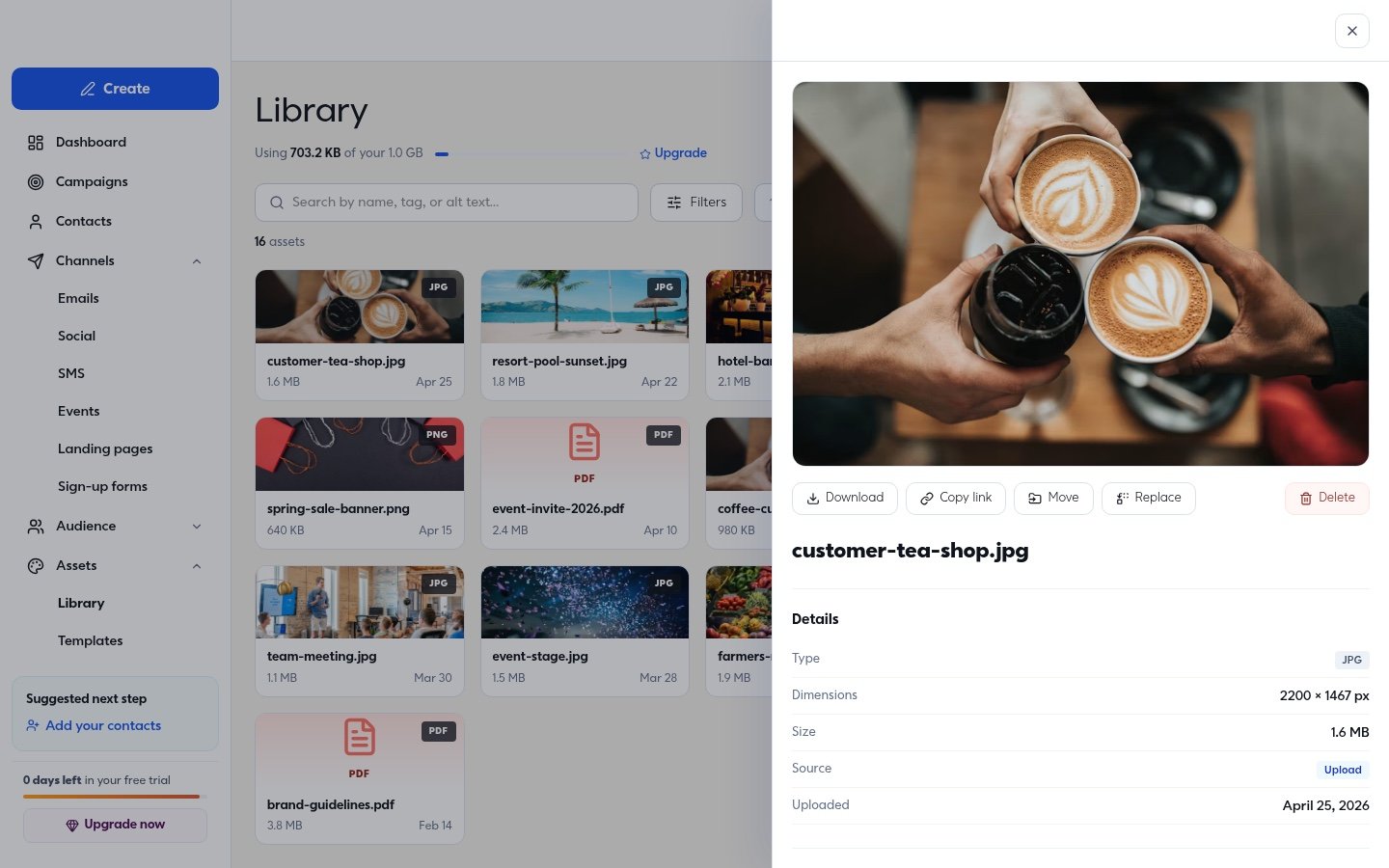
The default Library stays focused on finding and scanning assets. Selecting an asset reveals deeper controls only when they are needed, keeping the primary experience lightweight while providing access to download, copy link, move, replace, delete, dimensions, size, source, and other asset information.
Designing, testing, refining.
We tested the redesigned experience with customers to understand whether the new interface improved core workflows without introducing new friction.
Upload
All desktop participants understood how to add an asset without assistance and described the flow as easy and expected.
Batch actions
Two of six participants initially missed multi-select, revealing an opportunity to improve the visibility and contrast of selection controls.
Folders
Folder interactions were the least intuitive part of the desktop experience, giving us a clear area to refine.
Search
Participants independently asked for AI-powered search and auto-tagging, because inconsistent filenames make traditional search unreliable.
Finding an asset should not depend on remembering its filename.
Research uncovered an opportunity to move beyond filename-based search. Customers often upload assets from cameras, stock libraries, and other sources with inconsistent names. Content-based search and automatic tagging could make large libraries significantly easier to navigate.
A concept, not a shipped feature
Modernized without losing familiarity.
“Improve the workflow without disrupting the workflow.”
Customers responded positively to the redesigned experience, describing it as clean, straightforward, and modern while still feeling familiar within Constant Contact.
The redesign preserved the simplicity customers already valued while creating a stronger foundation for search, organization, asset management, and future AI-assisted discovery.
03 · Constant Contact